A Collection of animations I've made
The Family Road-trip
A Sonic college X DMJX colab
By smelling two unidentified smells, one pungent and chemically, one green and natural, my team created a story based on recoglections from family road-trips. Team-mates creditet in the credits.
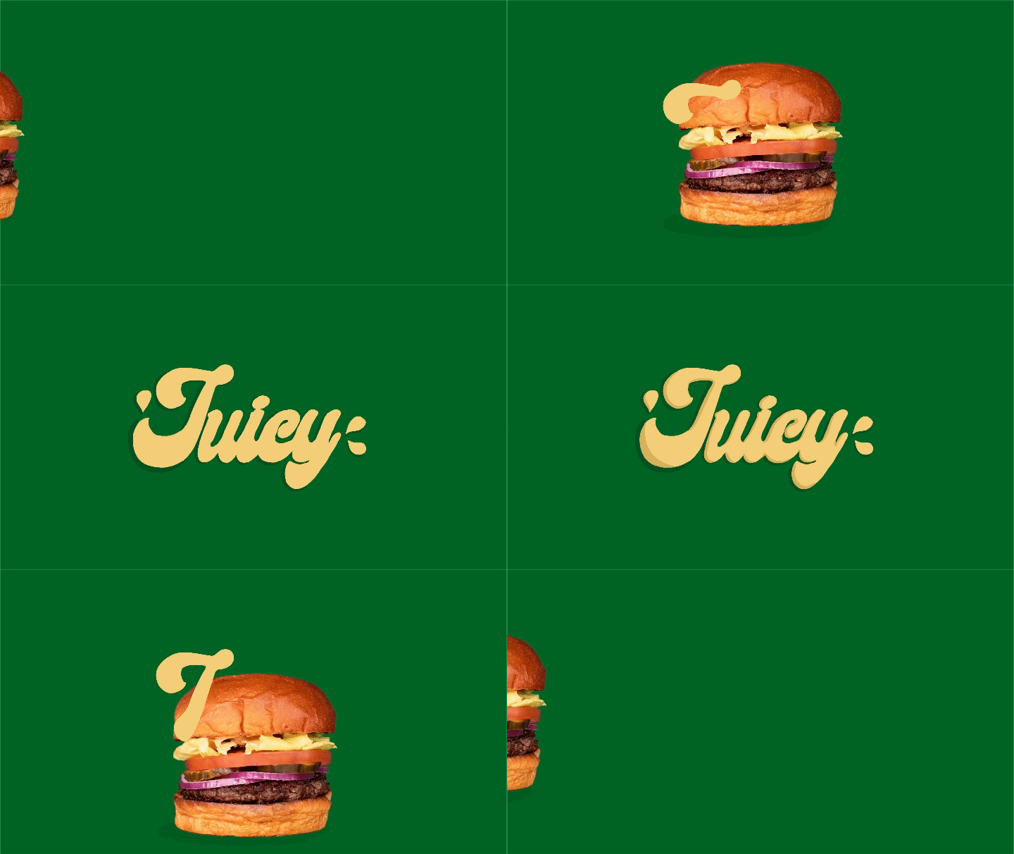
The Worlds Best Burger
Fuelled by the passion for crafting the perfect burger experience, I embarked on a journey to capture the essence of Gasoline Grill's culinary excellence in animation.
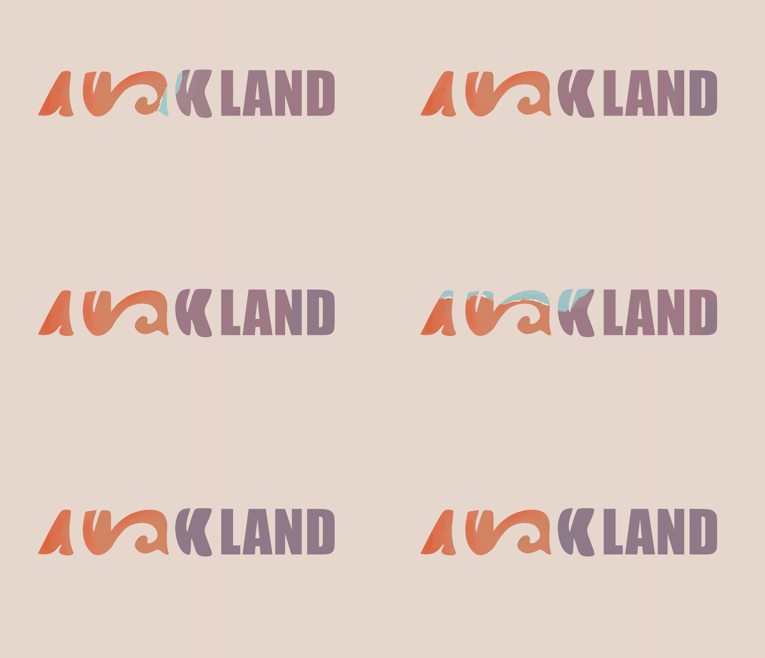
A Tribute to the Sea
At the heart of the logo lies the double wave, a nod to the vast expanse of the ocean that envelops Auckland and the integral role it plays in the city's identity.
From the Maori legend of the sea god to the modern-day legacy of Auckland as the City of Sails, the sea serves as a muse, inspiring reverence and respect in equal measure.
Introducing "Safe Circles: Your Safe Space Initiative."
In the heart of every dance floor lies a sanctuary where individuals find solace in self-expression. Yet, not every corner of the dance floor gleams with the same sense of security. That's where "Safe Circles" steps in—a beacon of inclusivity and safety amidst the pulsating rhythm of the music.
With "Safe Circles," we cast a spotlight on your personal space, creating a luminous boundary that radiates comfort and security. It's not just about lighting up the dance floor; it's about illuminating the importance of safe spaces within our communities.
This project was created for official Safer Space initiatives based in Denmark.
Motion-Infused Typography Inspired by Vietnamese Dance
Each letter of the word "scoop" is meticulously crafted to embody the graceful scooping motions found in this cultural art form.
Through fluid lines and dynamic curves, the letters come to life, mimicking the intricate movements of dancers as they gracefully sweep across the stage. With "Scoop," I aim to captivate viewers with a visual journey that celebrates the beauty of movement and the rich cultural heritage of Vietnam, all while pushing the boundaries of traditional typography.
Darkness Descends: A Personal Tale of Light's Demise
In a deeply personal narrative, I portrayed the triumph of light over darkness by filming ink swirling into intricate shapes in water. Through mesmerizing footage and kaleidoscopic animation effects, I brought this allegory to life, imbuing it with an eerie atmosphere. The haunting sound design further amplifies the sense of foreboding, capturing the journey as evil extinguishes all that is bright and airy. Until light again coquers, agains all ods.
Evolving Decay: Crafting 'The Last of Us' Trailer
In our "The Last of Us" trailer, we explored themes of decay and renewal using mycorrhizal imagery. Through animation, we depicted the unseen yet ubiquitous presence of these fungi. Layering multiple images, we created a dark, earthy atmosphere, symbolizing the delicate balance between life and decay in the game's world.
Credits: Created with Sallie Kapland & Nanna Larsen
Tour de Doodle

Celebrating the history of the bike race, through a humoristic nod to the old illustration style, used in posters, when the bike race first started out. It greets the four host countries, with famous monuments in the background. And it celebrates all the fans in the streets, that makes Tour de France.
Diesel
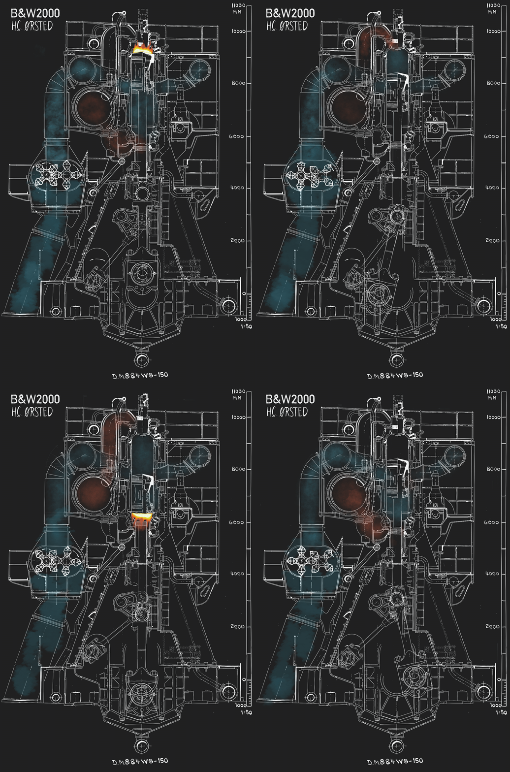
How does an engine work? And how can I inspire aspiring engine-egineers, throug design, to take up engine engineering?
Anti-bully


Julemærkefonden is an NGO that helps strengthen kid's feeling of selfworth.
The campaign outperformed previous campaigns.
More small animations!

I particullarly like mixing handdrawn illustrations with animations. I think there is a reasson we love the old Disney animations. It itsn't polished and the grittyness gives life.

Illustrated this little dude and gave him some wave-warp
in AE

A small animation I did for Julemærkefonden to test out style.
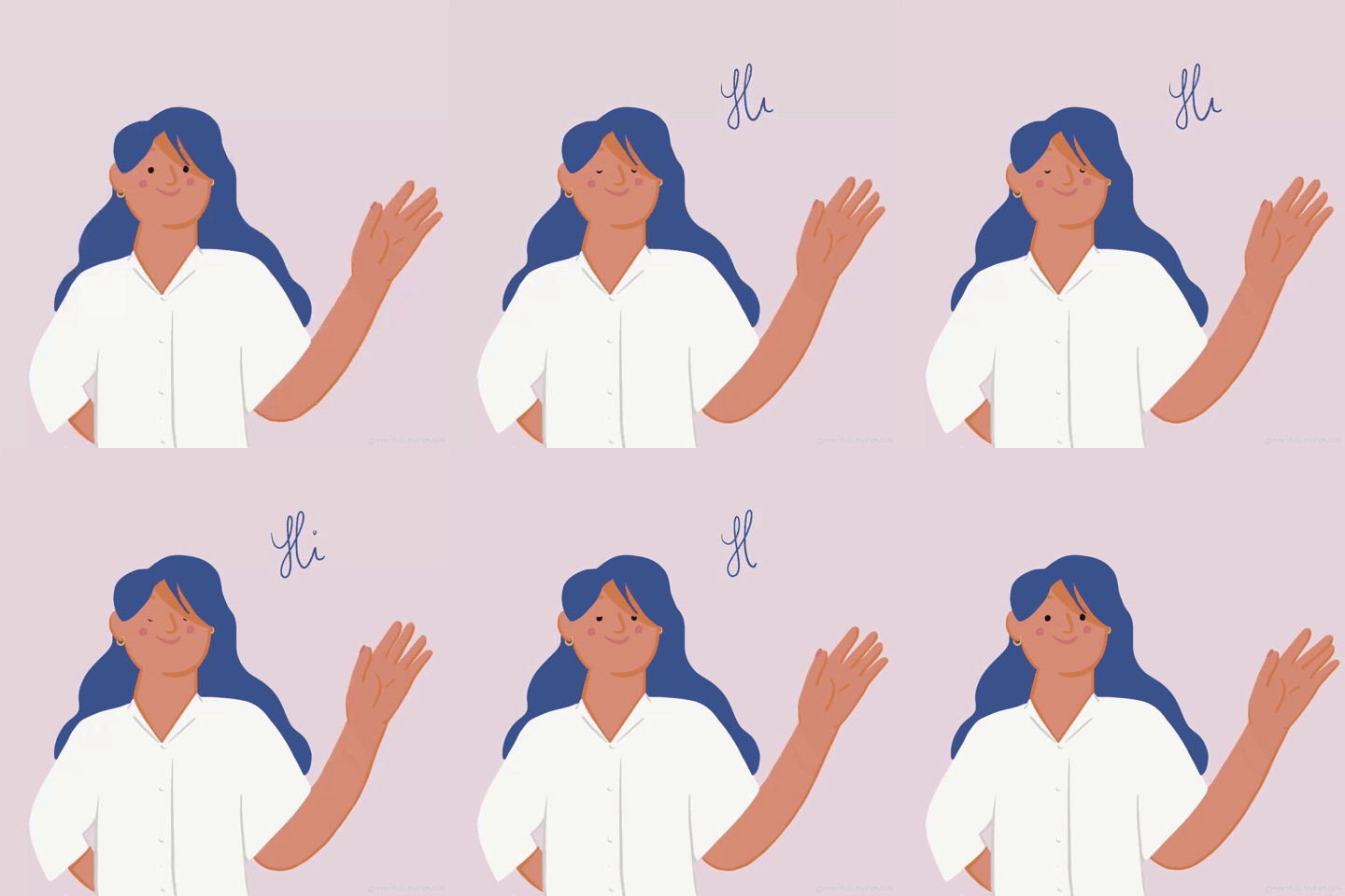
A self-portrait, to explain my up-and-coming journey: that I would finally pursue my dream of becoming a designer!
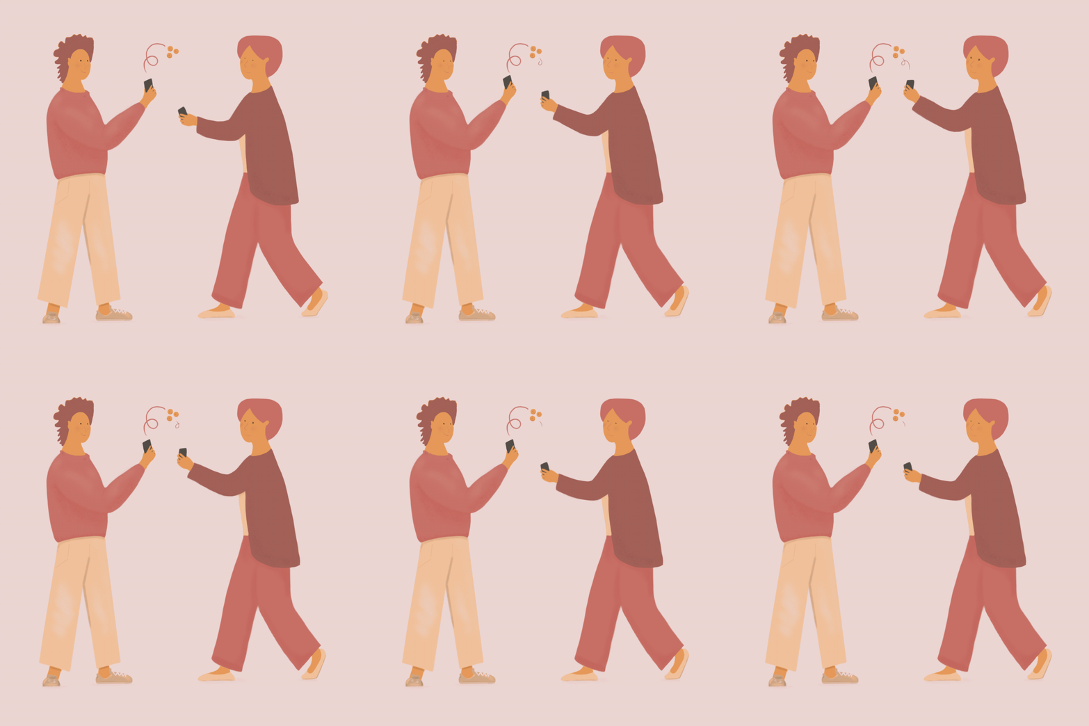
Practicing more frame-by-frame in Procreate.

We've all seen the bouncing ball, but a bouncy baloon-Maikie?
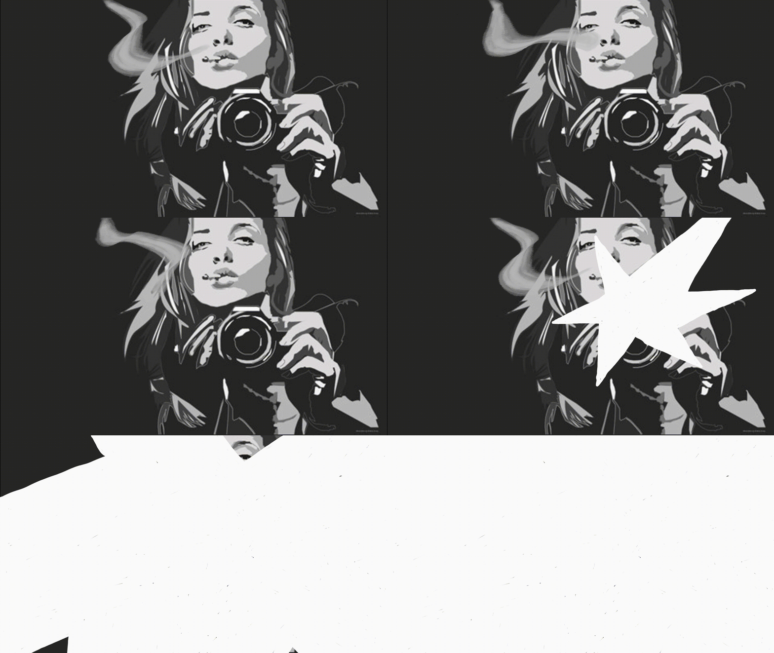
One of the first moments I went: How fun is putting life to my illustrations?!
Don't you wanna see more fun stuff? Scoot over to my Illustrations and watch the madness happening in the sketchbook of an artist!